Vagaro University
Transforming how businesses learn with Vagaro.
Some background & context.
Vagaro is a business management platform that supports beauty and wellness professionals in handling appointments, client relationships, inventory, and more. Vagaro University, the company’s learning hub, launched prior to my joining in Q3 of 2024. The site was built to offer users an offline but guided learning experience. However, the user interface made it difficult to navigate, leaving room for major improvements in both usability and overall effectiveness.

As the sole web designer on the team, I had the opportunity to reimagine the platform’s interface with a focus on improving both user engagement and conversion. The biggest challenge was that, because I was directed to use our in-house website building tool rather than building the site with code, I had to find creative solutions to work around the lack of a search function. My approach centered on two key goals: (1) establishing a visual identity that reflects Vagaro’s brand, and (2) designing a fun, intuitive user flow that encourages learning and exploration.
Learning a new tool is frustrating, especially without the right answers.
Business owners and service providers already juggle multiple roles from delivering services and managing operations to handling everything in between. Finding the right educational resources shouldn’t be another challenge. Access should be simple, immediate, and stress-free.
Users want answers, so what’s stopping them from finding it?
My first goal was to analyze the current task flow to identify where the disconnect was occurring. The previous version of Vagaro University prioritized pushing content rather than guiding the user journey. As a result, the experience often left users overwhelmed, leading to high exit rates and unanswered questions.
Takeaway: lack of structure
Users want quick answers. They often only have a few minutes between appointments to get the help they need.
Takeaway: lack of individuality
Every thumbnail looked alike, making it difficult to pinpoint what you’re looking by a quick sweep over the page.
Takeaway: lack of context
For first-time users, it was easy to get lost without clear direction or explanation of what the site offers.
Defining the audience to target specific needs.
Business owners and service providers already wear many hats, serving clients while managing day-to-day operations. Finding the right educational resources shouldn’t add to their workload. Access should be simple, immediate, and stress-free
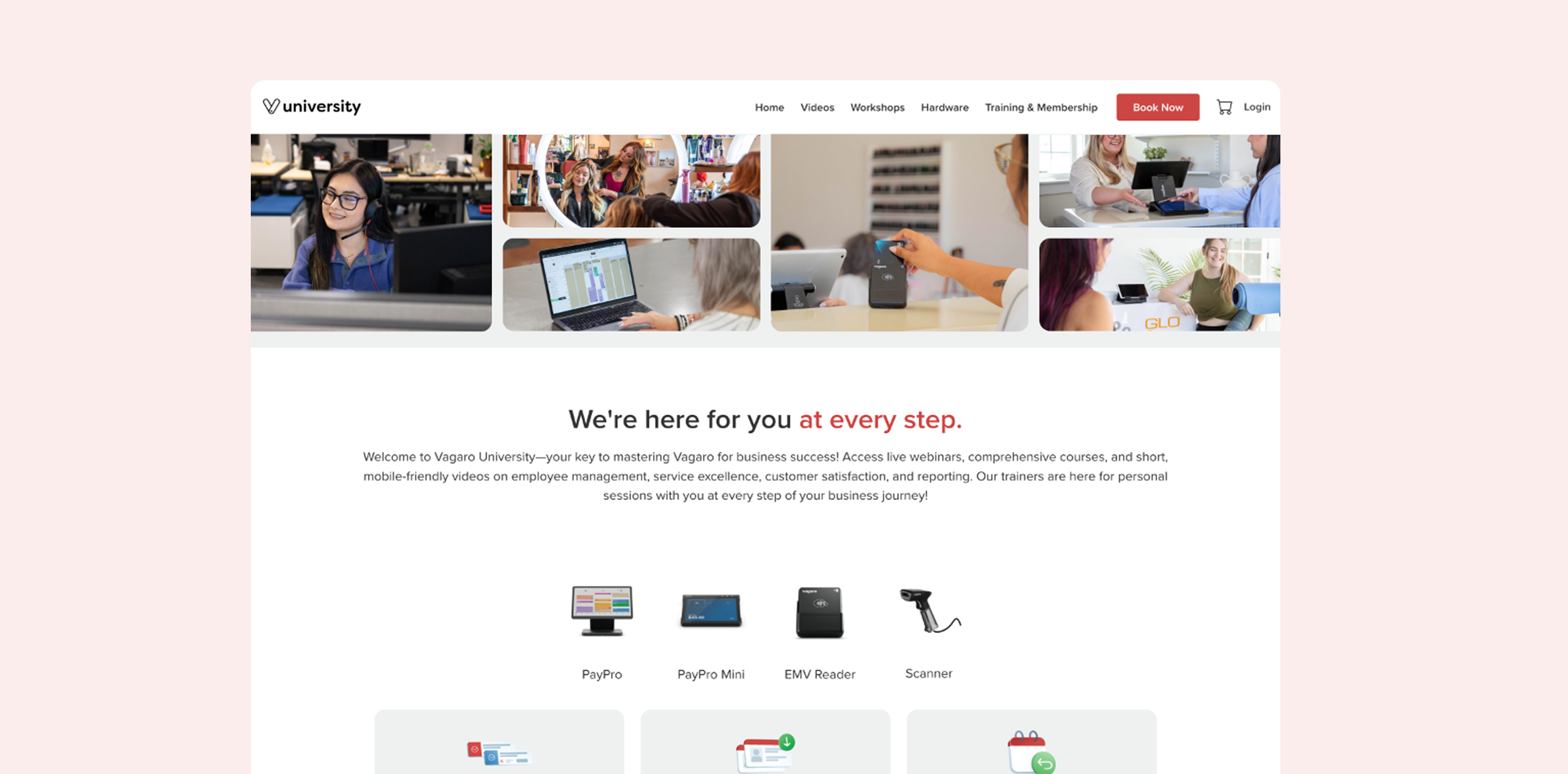
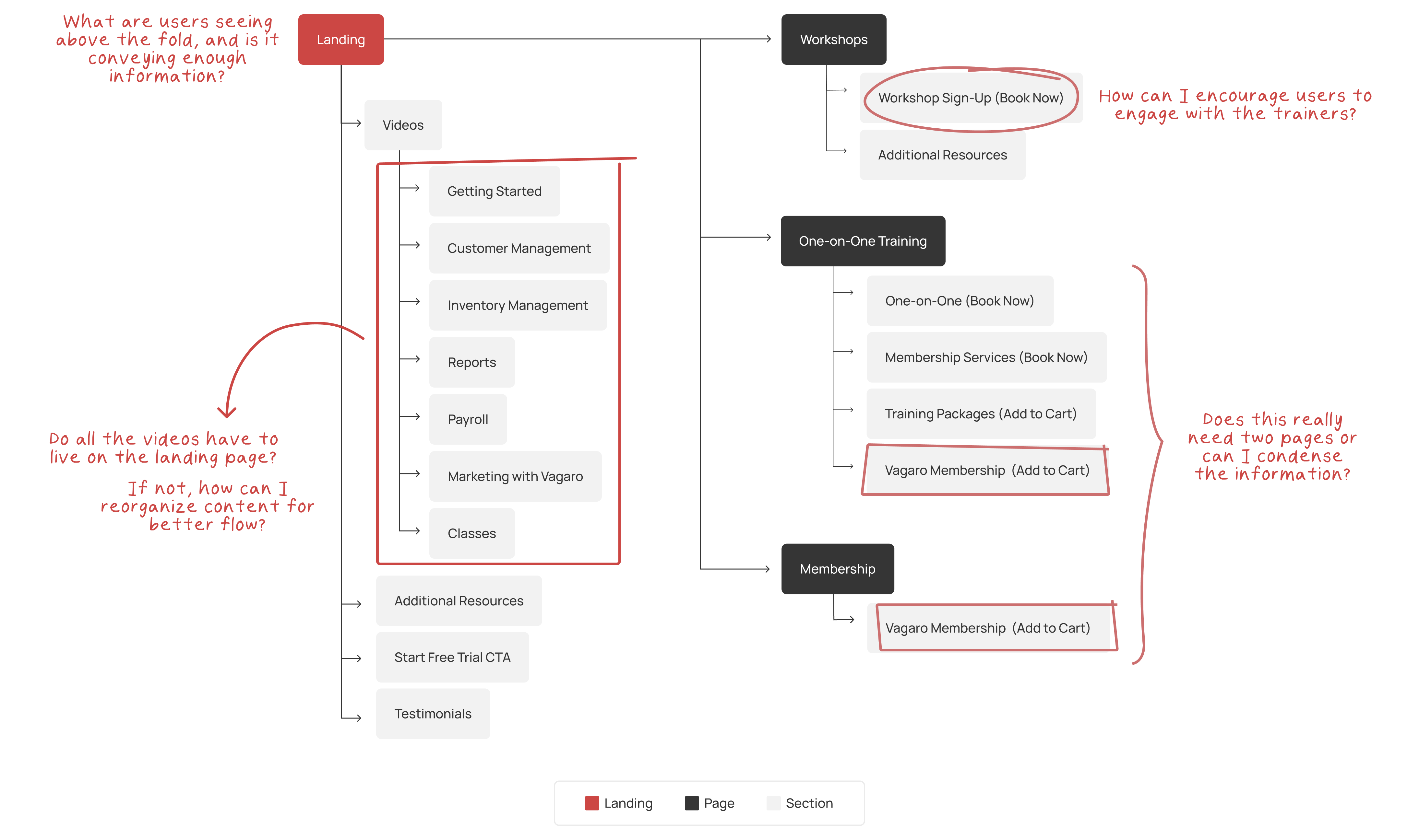
Creating two distinct user flows.
Using the four personas, I developed two primary paths users typically follow when seeking help. Some are looking to fully train and master the tool, gathering comprehensive information to support their business. More often, users are searching for specific answers to specific questions. To support both journeys, I created a dedicated video page, giving users the option to explore either path.
By Category
The videos are organized by feature, with each category covering a specific aspect of the platform. If a user wants to learn how to generate different types of reports, they’ll find all related content grouped under that subpage.
BY BUSINESS STAGE
These videos are curated by the team to help users navigate critical milestones in their business journey. The courses are designed to guide consumers in using the software efficiently to achieve their goals.
Establishing a brand identity.
Instead of treating the site as just an extension of the company, I wanted to give it its own identity. Building off Vagaro’s Calendar feature, I repurposed its color palette to infuse the site with energy and personality, rather than relying solely on the primary red brand color.
Final details
before
As soon as users land on the page, they’re immediately thrown into the content with little context. There’s minimal guidance on what each section includes, which makes the experience feel disjointed and difficult to navigate.
after
I replaced anchor links with dedicated pages for each topic. This modular structure made the content easier to navigate, improved focus, and supported a more intentional learning flow.
before
The thumbnails were unclear and visually similar, making it challenging for users to quickly identify the content they were looking for. The lack of differentiation prevented users from easily skimming and pinpointing specific resources.
after
I incorporated elements from the software covered in each tutorial, allowing users to visually connect with the content. Each course was assigned a unique color, making it easier for users to quickly identify and navigate to the category they needed.
before
Workshop sign-ups were low, despite being designed to encourage participation in group training sessions, address questions, build relationships, and foster stronger brand loyalty.
after
I gave the workshops their own unique identity and added a 'video archive,' where users could access pre-recorded sessions, offering more flexible learning and greater engagement.
Reflection
Redesigning Vagaro University was an exciting challenge that pushed me to create structure and clarity in a previously cluttered interface. Working within the limitations of our in-house builder, I focused on improving usability, streamlining the learning flow, and developing a clear visual identity that aligned with the Vagaro brand.